My favourite alternative to Excel dashboards
Excel dashboards are great… what? 😯
For all the complaints that people have for Excel, it still has many clear, indisputable advantages.
For one, it is extremely accessible - almost everyone has Excel installed on their computer. It’s familiar to most people, and practically anyone who can use a computer will know how to perform basic operations like doing a SUM function or filter a column.

In the context of sharing analysis or findings, Excel more importantly has portability. By this, I am referring to Excel’s ability to run in a very wide range of circumstances:
You can send stand-alone Excel files over email, share them with colleagues/clients over SharePoint
You can open Excel files without internet if you’re stuck in a rainforest or the London Underground (!)
There is no requirement for additional installed software other than Excel
There is no need for the dashboard to communicate with a server
Moreover, Excel files are also virtually free to create, as realistically you don’t need to take out any additional licenses in order to create/host a dashboard in Excel, unlike Tableau or Power BI where there is at least some cost for a practical commercial deployment. Its ease of use and wide availability arguably also makes it easier for your team to collaborate on putting a dashboard together.
Advantages of Excel
Therefore Excel has many advantages then:
- Accessible / Familiarity
- Portable
- Virtually free
- Easier for collaboration 1
But do all of these advantages sufficiently justify sticking to Excel when you want to deploy a ‘dashboard’ solution?
What is a dashboard?
Before I dive into the limits of Excel, there’s a question: what is a dashboard supposed to be anyway?
Gartner’s IT glossary defines a dashboard as:
… a reporting mechanism that aggregate and display metrics and key performance indicators (KPIs), enabling them to be examined at a glance by all manner of users before further exploration via additional business analytics (BA) tools.

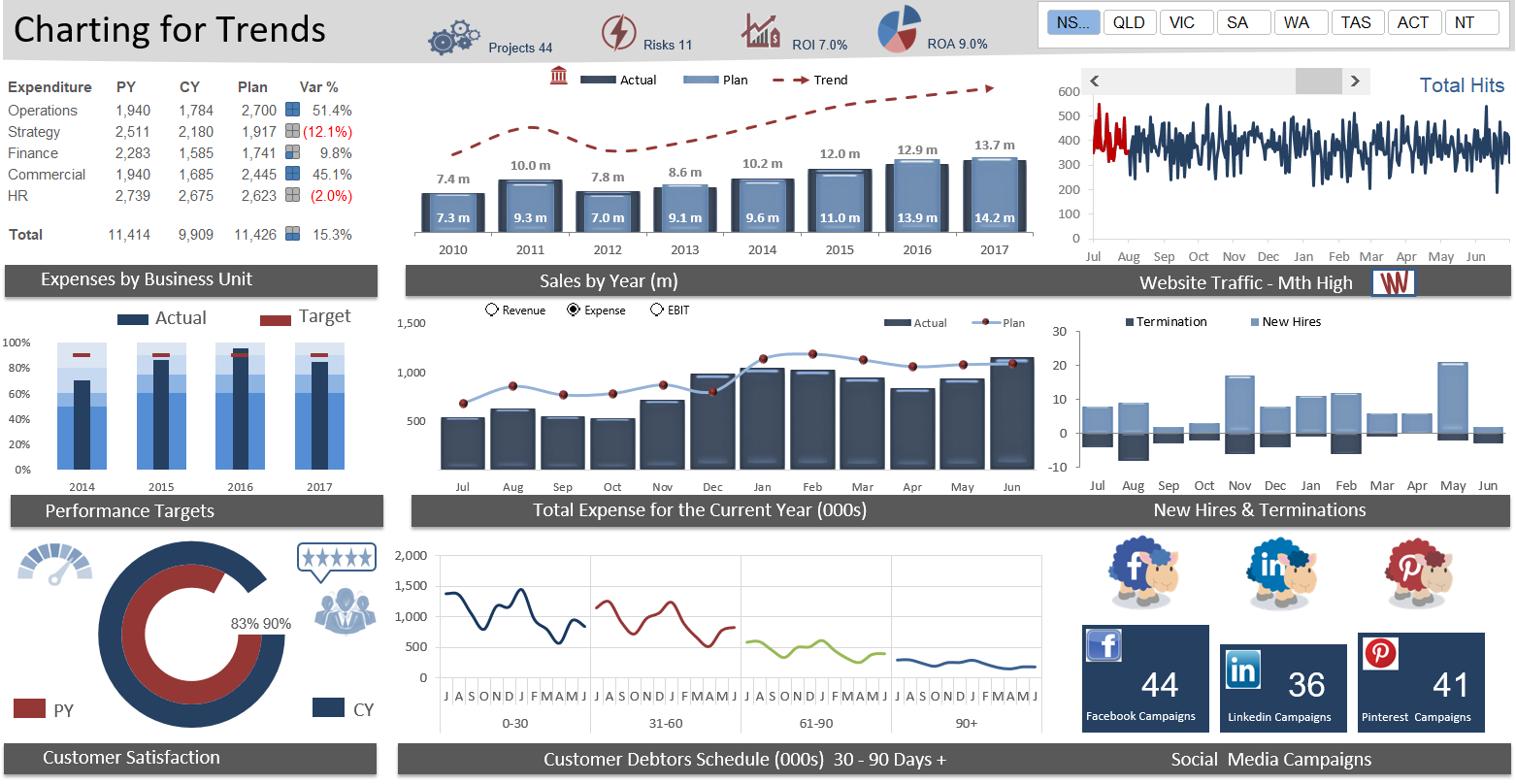
Excel dashboard image from https://www.thesmallman.com/excel-dashboard-course
By a ‘dashboard’ solution however, I’m thinking in terms of a broad, but also minimal definition. A dashboard doesn’t need to be used for displaying KPIs, for one. I’d go for something simple, like:
Dashboard: a collection of visualisations with at least some degree of interactivity, available in a single and typically layered visual space.
(‘Layered’ refers to drop-downs, sheets, pages, tabs, etc.)
One could argue that interactivity is not a requirement for a visualisation dashboard, but I do think where the user can have some control over the data that is shown (e.g. tooltips, hovering effects) does make a dashboard importantly different from say, a PowerPoint slide deck.
Under this broad definition, Excel certainly can provide a lightweight, portable, easy-to-setup dashboard solution for commercial deployment.
Limits of Excel
In my personal experience, the limitations of Excel dashboards come from two main areas:
- the limits of its visualisation capabilities and options, and
- the limits of its data analysis capabilities.
The first point is straightforward: the visualisations that you can display on an Excel dashboard are limited to the charts that are available through Microsoft Excel. Although you can do most of the things that you might want to do (bar charts, line charts, etc.), more specific features such as network graphs, faceted bar charts, sankey diagrams, and word clouds are practically impossible to create.
The second point of criticism is more around the fact that Excel isn’t simply designed for more complex analysis tasks, such as grouping large number of records (even 10k+), running slightly more complex regression / classification models, or text mining tasks like analysing ngrams. This means that the data contained in the dashboard must be a summarised output created from another software / environment (e.g. R, SAS, SPSS), requiring an additional step between analysis and visualisation. Although it might sound like this is only one additional step, this has implications for scalability: if your task is to create 100 of these Excel dashboards, how do you reliably and quickly get the analysis you’ve done in a separate analysis program into Excel? Sounds like a bit of a nightmare! 😨
What’s a good alternative then? 🤔
The ability to perform both analysis and visualisation in a single environment is probably one of the most attractive advantages of Shiny. The fact that it is based in R also means that it is by no means limited (effectively unlimited) in terms of the charting libraries available:
- ggplot2
- plotly
- rbokeh
- highcharter (caveat: you need a license if you’re using Highcharts commercially, but otherwise free to use)
- dygraphs … to name just a few!
I wouldn’t, however, say that Shiny is the best alternative to Excel - given the requirements that I need to meet in terms of client deliverables. From my personal experience, where Shiny leads on interactivity, it suffers on accessibility and portability. Deploying a Shiny app typically requires hosting through Shiny Server, or through shinyapps.io, where the user will require an internet connection for access. Hosting a Shiny app on shinyapps.io with credentials require a hosting fee, unlike Excel which you can encrypt for free. My personal experience is that clients or end-users perceive web apps to be less reliable, as it is dependent on the server / internet connection working properly, whereas Excel files wouldn’t fail in the same way.
flexdashboard 🔥
My favourite alternative actually is flexdashboard, which is importantly different from Shiny in that it is possible to run itself as a stand-alone static HTML file that doesn’t depend on communicating with a back-end server.
Effectively, this is a single HTML file with interactive features (though not as interactive as Shiny, if that makes sense) that opens up in a browser, and which you can send via email or host securely on SharePoint. You still have access to all the charting libraries that are available in R, as long as the libraries themselves can run without communicating to a server - plenty of examples are available on RStudio’s html widgets gallery. All the production is done in a RMarkdown document which you would use the flexdashboard package in combination with knitr to create the static HTML dashboard document.
As Jonathan Ng pointed out to me, using the DT package within flexdashboard means you can add interactive buttons that lets the user download data as Excel, CSV, or PDFs - an incredible interactive feature through static HTML!2
I’ve also created a demo flexdashboard on my website which I aim to showcase some examples of what you can do with a static HTML dashboard. Check it out! I aim to continuously update this as I explore more available HTML widgets.
Conclusion
Let’s look back at some of the points that we laid out as the strengths of an Excel dashboard solution, and see whether flexdashboard covers them:
Accessible / Familiarity: YES - it’s safe to assume that most computers, if not all, have internet browsers, in which the HTML dashboard will load properly. Familiarity does come down to the UX design the of the dashboard, but a flexdashboard will generally be intuitive to operate.
Portable: YES - you don’t need an internet connection, and static HTML files can easily be sent via email.
Virtually free: YES - because there’s no hosting needed, and R itself is free.
Easier for collaboration : I’d say YES, on the condition that your team is also familiar with R. The fact that flexdashboards are written in code means that it’s easier for two or more people to be working on the same dashboard at the same time than an Excel file. If done properly, R code is also more readable than Excel cell references.
So hands down, flexdashboard is my favourite alternative to Excel dashboard!
